삭제 버튼은 확인창을 만들기 위해 react-confirm-alert를 사용함
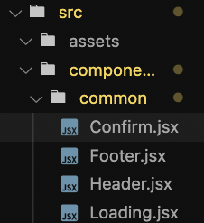
- 공용으로 쓰기위해 confirm 컴포넌트의 위치를 common에 만들어준다
- confirm의 내용
1
2
3
4
5
6
7
8
9
10
11
12
13
14
15
16
17
18
19
20
21
22
23
24
25
26
27
28
29
30
31
32
33
import "react-confirm-alert/src/react-confirm-alert.css"; // Import css
import styled from "styled-components";

const ConfirmStyle = styled.div`
  //원하는 스타일 적용
`;
export default function Confirm({
  onClose,
  title,
  content,
  arg1,
  arg2,
  callback,
}) {
  return (
    //class='custom-ui' <<react-confirm-alert 에서 모달창 스타일을 만들어줌
    <ConfirmStyle className="custom-ui">
      <h1>{title}</h1>
      <p>{content}</p>
      <div>
        <button
          onClick={() => {
            callback(arg1, arg2);
            onClose();
          }}
        >
          Yes!
        </button>
        <button onClick={onClose}>No~</button>
      </div>
    </ConfirmStyle>
  );
}
- Confirm을 호출할 위치에 아래의 내용 삽입
1
2
3
4
5
6
7
8
9
10
11
12
13
14
15
16
17
18
19
20
21
22
import { confirmAlert } from "react-confirm-alert"; // Import

const handleDeleteClick = () => {
  //삭제 버튼
  const title = "메모 삭제하기";
  const contents = `${content.title}을(를) 끝내셨나요?`;
  confirmAlert({
    customUI: ({ onClose }) => {
      return (
        //callback에 삭제를 누르면 실행될 이벤트를 넣어주고 arg를 props로 넘겨줌
        <Confirm
          onClose={onClose}
          title={title}
          content={contents}
          arg1={url}
          arg2={id}
          callback={fetchDelete}
        />
      );
    },
  });
};
- 결과
